What is Color Continuity?
The essence of design and color continuity is, many separate elements fitting seamlessly together. Subtle tones in rugs might be reflected more boldly in throw pillows. Wall or ceiling colors might be reflective of the mid-tones found in seating, fabrics or granite countertops.
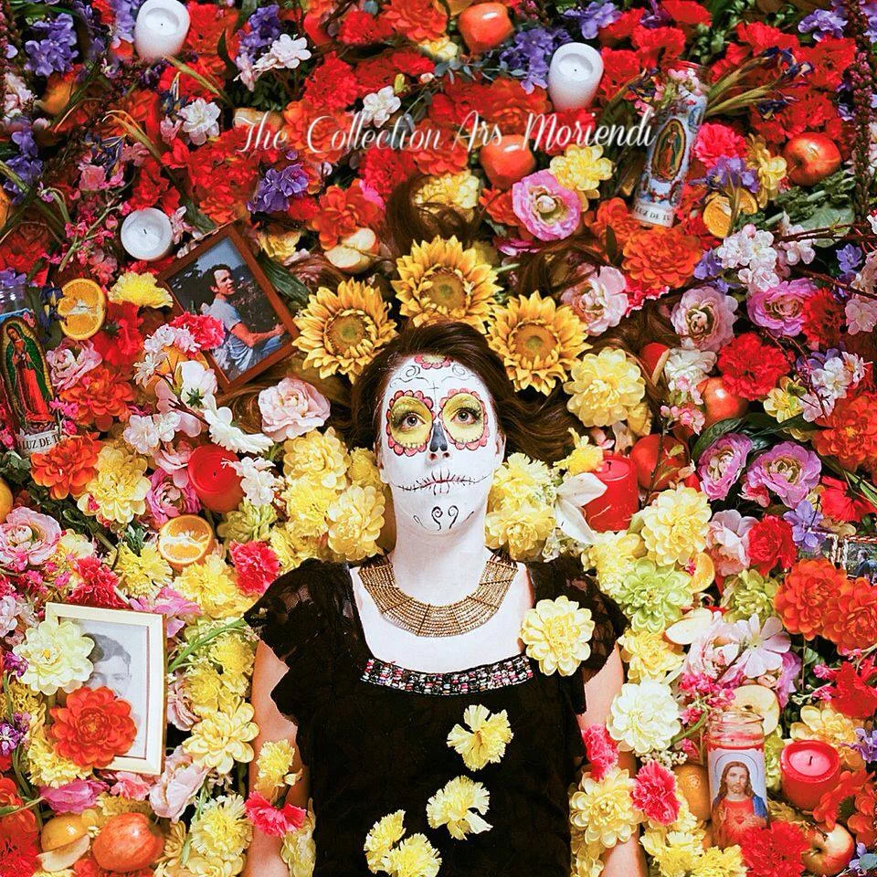
Our first example is what happens when someone inherits 20 bolts of the same fabric from their great aunt Tessie. This is not design continuity, but could rather be described as painful monotony.

Picture: www.blog.cavernhome.com Source: Supplied
When considering where to start the color selection process, identify the anchors in your space, such as large rugs, furniture or items of necessity. The anchors are the non-negotiable items, such as countertops, the living room sofa, dad's recliner, etc... By identifying our hard surfaces and fabrics first, we will increase our chances for a successful design by leaving the more flexible selections, such as paint colors and accent pieces to tie it all together.
Paint colors, wall and ceiling finishes are most often the glue that holds the completed palette together. The essence of good design is balance and continuity. Consider the subtleties in this next image that work together to form an engaging mix of color and texture.
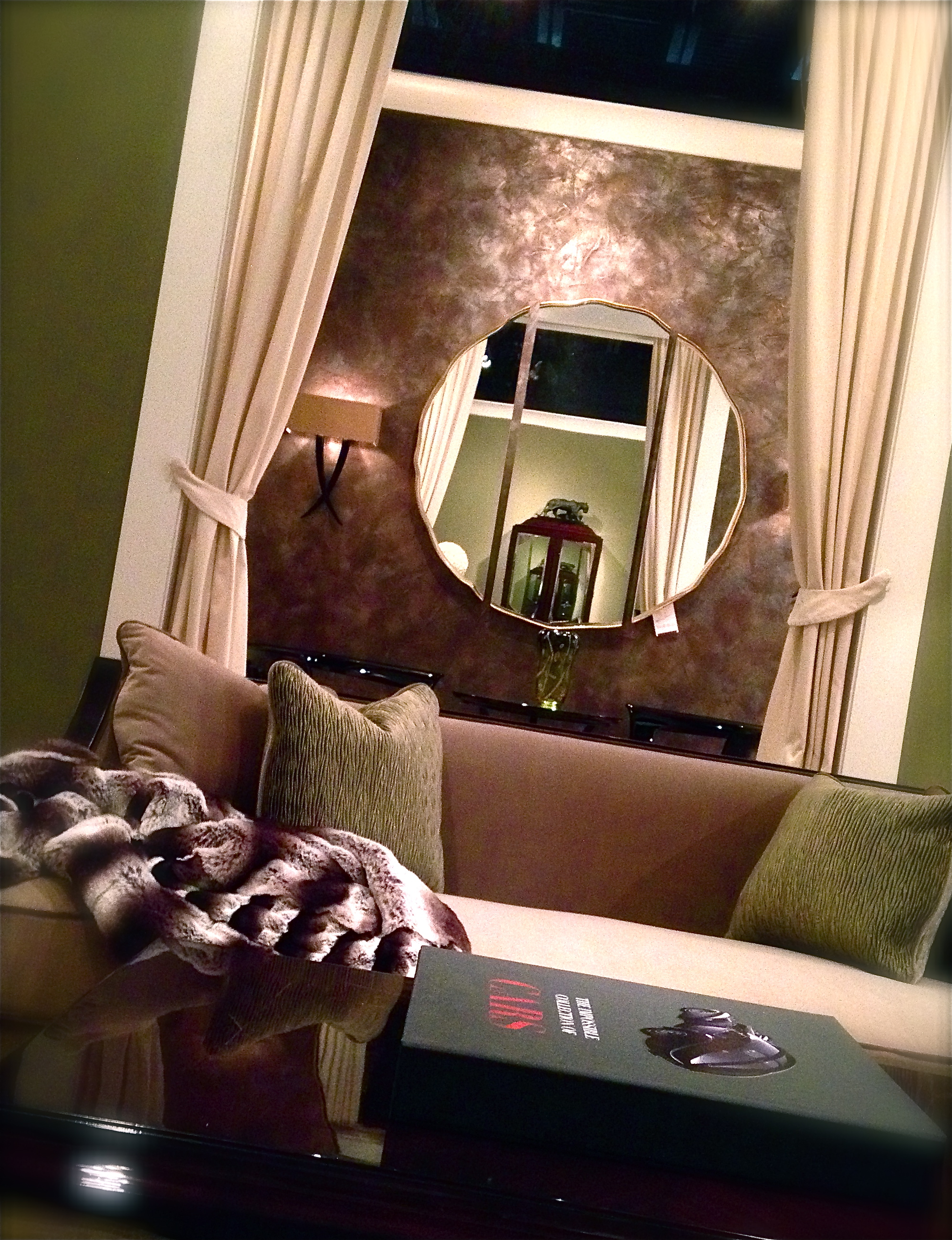
Designer, Jon Spurlock created an inspiring and inviting setting by incorporating a balanced mix of color and texture. By selecting a custom wall finish for the adjacent room, he achieved an extra layer of depth and texture while affirming color continuity between the two spaces.
Guy Showroom - 2013 - High Point NC
Decorative wall and ceiling applications often work as a binding agent, holding multiple design elements together. Custom color development affords a high yield of design success, by pulling nuances from many separate elements and marrying them together for a seamless balance of color and texture. Below are a few examples of custom finishes that were designed around fabrics, patterns and/or anchor pieces.

Influence of India: Interior designer, Mack Jones envisioned a transitional palette for this powder room. By mixing the cracked and pitted old world texture with a modern design pattern, we achieved the delicate balance he was looking for. The wall pattern is a champagne foil, stain to the coincide with the eggplant tones in the granite.

In this mid-production shot of a rotunda style foyer, you can see, we incorporated a ceiling pattern that reflected the ironwork on the stair rail spindles. The ceiling was finished in a chocolate Venetian Plaster and embossed with a metallic gold Venetian Plaster.

This mixed medium Venetian Plaster finish was develop specifically for the window treatment fabrics, shown here and was used on the ceiling in a dining room and adjacent powder room.

This custom Old World Mediterranean finish was developed specifically for the fabric selection. Notice how the cracks open to hint at the fabric's cranberry and brown tones, while the blue/green accents reflect the bird feathers. Over all mid-tones are transposed a neutrals and olive tones.
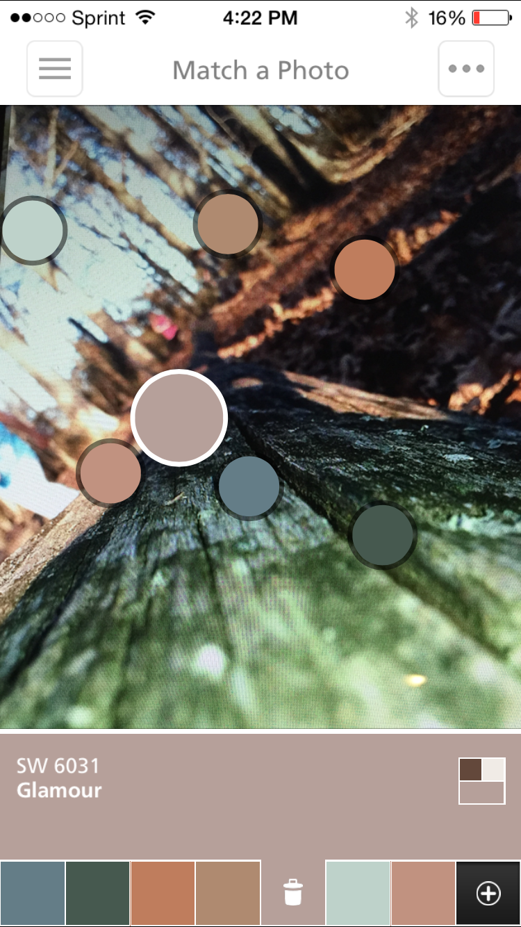
I hope these examples will serve as inspiration for you on your next home decorating project. As a final piece of advice, I would suggest that you avoid forcing it. Choose mid-tones in your anchor pieces for wall colors or decorative finishes. Perhaps the most beautiful example and teacher of color continuity is nature. Take a walk with your camera phone through the woods or community gardens for inspiration. The image below was taken with my iphone a few days before the sample above was created. Not only did I have a palette to work with, but I had nature as a guide on how to incorporate the colors.

Nature is the greatest teacher of color continuity.
As an additional resource, consider downloading the ColorSnap App from Sherwin Williams. It has the ability to match color elements in your photos to paint selections. Below is an example of selections the ColorSnap App gave me for the above image.

Cheers and Happy Decorating!!